

CSR3 - Street Car Racing
UX Vision & Ecosystem Architecture


Role: Senior UX Designer (Acting Lead)
Team Leadership: I owned the UX vision on the project for nearly three and a half years. For the first two years, I operated as the solo UX designer, establishing the foundational architecture and user journeys from scratch. As development expanded, I scaled the team by onboarding and managing two additional designers, optimizing our workflows to significantly accelerate delivery.
Cross-Functional Partners: Partnered directly with Creative, Design, Product, and Art Directors to establish and drive the overarching product vision; led day-to-day agile collaboration across UX, Game Design, Product Management, UI Art, and Engineering leads to ensure seamless feature execution.
Status: Contributed to the title through from August 2022 till February 2026, building the foundation for its subsequent 5-country Tier-1 soft launch before the parent company strategically realigned its project portfolio.
Portfolio Disclosure & Confidentiality Notice: To respect non-disclosure agreements (NDAs) and proprietary IP guidelines, this case study emphasizes overarching UX architecture, systems design frameworks, and public soft-launch material (v0.32). Proprietary production files and internal wireframe archives have been omitted or anonymized.
Executive Summary & Project Overview
-
Franchise Evolution: After eight years, CSR2 reached its architectural limits, making it difficult to maintain long-term player retention while trying to expand gameplay systems.
-
Player Pain Points & Legacy Friction: Community feedback and support data revealed deep player frustration with CSR2: navigate-heavy UI that broke under feature creep, a cluttered map, tedious management of 100+ cars across multiple garages, and a single-car upgrade meta that made garages feel stale and unrewarding.
-
New Gameplay Depth: To address these pain points and future-proof the franchise, CSR3 introduced dynamic cornering, terrain/weather conditions, a multi-car squad model, car to track affinity system, multiple car classes and a shard-based collection system designed to make garage progression feel fresh and varied.
-
Strategic Alignment: Partnered directly with the Creative Director, Game Design Director, and Product Leads to translate player feedback and retention drop-offs into strategic design goals, aligning creative ambition with commercial viability.
-
Modernized Experience: Established foundational UX pillars and led execution to transition the title into a scalable car-RPG experience, prioritizing state-aware navigation, faster time-to-race, and a clear tactical information hierarchy.
Project in Action - 0.32 Release
To provide visual context for the product and gameplay, here is a community playthrough of the v0.32 soft-launch build. It shows the live product in motion including the garage hub, interface shell, and core racing experience.
Delivering on this level of visual immersion while keeping deep car-RPG progression intuitive required a cohesive, system-wide design framework. To align our cross-functional team and guide every interface decision across features, I established the following foundational UX pillars:
UX & Design Pillars
To translate high-level product goals into a cohesive player experience, I collaborated closely with the Creative Director, Game Design Director, and Product leads to align on the core vision for CSR3. From this cross-functional alignment, I established five foundational UX pillars that served as our north star guiding every architectural decision, feature framework, and interaction pattern across the entire title.
1. The "Hero Roster" (Car-RPG Framing)
Treat every vehicle as a high-end 3D showpiece and a specialized class car. Streamline team-building and roster management without burying the cars under heavy UI data.
2. Tactical Clarity (Class & Surface Matching)
Make track affinity immediate. Use glanceable badges, color-coded terrain/weather tags, and clear stat deltas so players instantly know if a car class fits the upcoming race.
3. Frictionless Garage-to-Track Loop
Optimize the bridge between deep out-of-race management (upgrades, car mods, roster management, car aquisition) and quick races by stripping out redundant sub-menus and dead-end confirmations.
4. Contextual Guidance (Always-Informed Progression)
Prevent decision paralysis across Campaign, Seasons, Race Pass, and Live-Ops. Surface the single best "Next Action" directly on the hub to keep progression effortless. Communicate about upcoming events, offers and the next big update through banner system on home page.
5. Layered Mastery (Easy to Enter, Deep to Master)
Keep initial play approachable through straightforward car collection, campaign racing, and free pass progression, while offering deep mastery via shard-based mod tuning and strategic car-class-to-track matching for maximum performance.
UX Methodology & Concept Validation
Across CSR3's development, I established a multi-stage UX validation pipeline to evaluate interaction frameworks, align cross-functional leads, and refine usablity prior to full engineering implementation:
Generative Discovery & Problem Framing: Partnered with Data Analytics and User Research at day zero to analyze telemetry drop-offs, review player feedback, and conduct qualitative interviews. This upfront research defined root-cause player pain points and mental models before exploring potential UI solutions.
Divergent Exploration & Concepting: Explored multiple structural concepts and low-fidelity interaction models to address the identified player problems. By testing contrasting layouts early, we eliminated high-friction ideas before committing to high-fidelity design.
Interactive Figma Prototyping: Built low- and high-fidelity click-through flows to evaluate task completion speed, navigation comprehension, and interface ergonomics prior to engineering handoff.
Cross-Project Playtesting: Organized structured internal playtests with studio members outside the core project team to gather objective feedback from participants with zero feature bias.
External Qualitative Research: Partnered with an external user testing studio in Brighton (VGM) to run qualitative usability sessions with target racing players and automotive enthusiasts, evaluating feature comprehension, UI clarity, and friction points.
A/B & Cohort Testing: Evaluated player telemetry, drop-off funnels, and engagement metrics across player cohorts during soft launch, running A/B tests on key UI flows to validate layout changes against real player behavior across five geos (Canada, Singapore, Australia, France, Philippines).
Core System Deep Dives
Over the course of three and a half years, I shaped more than 15 major game features, live-ops systems, and progression loops across the title. To best illustrate my approach to systems thinking, interaction design, and UX leadership, the following deep dives focus on foure foundational pillars: the global architecture, the UI components system, the UI components system and an exciting car team based game mode.
Deep Dive 1: Adaptive Global top/bottom bar/tabs navigation system
Problem Statement
In early development, CSR3 carried over CSR2’s rigid navigation setup, where top and bottom controls were hardcoded into individual screen files rather than built into a unified global frame. This created significant engineering debt through manual multi-screen updates and caused persistent layout bugs on notched displays. Functionally, these static UI bars cluttered focused tasks like upgrading, trapping players in nested sub-menus and requiring repetitive back-tapping just to return to the core loop.
Solution
To solve this, I designed a state-aware Global Navigation System that decoupled the top resource bar and bottom controls from individual screen prefabs, unifying them into a single flexible UI shell. This system dynamically adapts layout density and button priorities based on screen resolution and player intent:
Decoupled Global Shell: Separated universal navigation controls from scene files into a persistent framework, enabling live-ops feature integration without layout refactoring.
Auto-Scaling Top Bar: Dynamically adjusts resource counter font sizes and icon spacing to prevent text clipping across varying device aspect ratios and notch configurations.
State-Aware Bottom Bar: Retracts central navigation nodes during deep task workflows (e.g., car upgrading or tuning) while expanding the primary action CTA into the focus zone.
Streamlined Interaction Loop: Eliminates viewport clutter during critical decision moments, significantly reducing menu friction and redundant back-tapping.
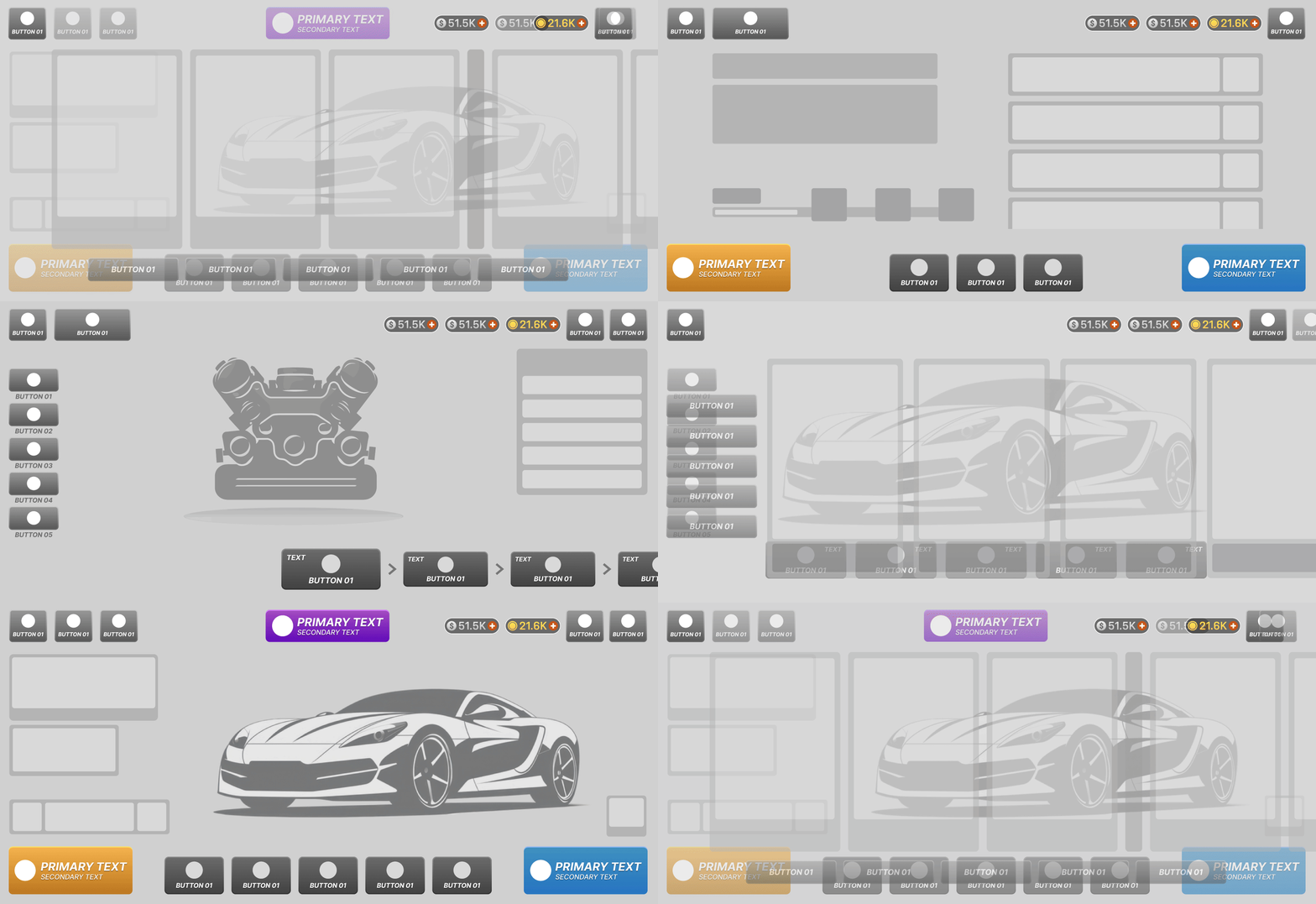
Low fidelity GIF of how the top/bottom and side navigation system adapts across the game

This sitemap covers the top & bottom bar navigation across the key screens in the game.
State 1: Exploration

Garage Hub: Full 5-slot navigation bar & primary entry points active.
State 3: Deep Upgrade Loop (Task Focused)

Upgrade: Global nav hidden; replaced by horizontal part-selection carousel.
State 2: Mode Selection

Race Menu: Top bar collapses non-essential currencies; bottom bar adapts to sub-tabs
State 4: Post Race Rewards (Primay CTA Focus)

Race Results: Primary 'Next Race' CTA expanded to maximize flow speed.
Impact & Key Results:
-
Data-Driven Navigation: Built a modular UI frame to dynamically swap core feature entry points based on live telemetry without engineering layout refactors.For e.g. replaced Collections with Imports or Customization with Refit.
-
Gacha Accessibility & Monetization: Elevating Imports (gacha) from a buried sub-menu directly to the primary bottom bar drove an immediate surge in daily footfall, increasing total pulls and boosting demand for Gold and Silver credits.
-
Visual Modernization & Real Estate: Replaced the legacy full-width bottom bar which permanently occupied screen real estate even when displaying just one or two buttons with a dynamic, floating button bar that retracts to maximize 3D car visibility.
Deep Dive 2: UX Design System
Overview
I architected and maintained the core UI/UX design system for CSR Racing 3. To support a feature-rich, live-service mobile game with endless vehicle variations and live operations, the design system needed to bridge high-end automotive aesthetics with ultra-clear data hierarchy. I established a scalable, modular component library that ensured consistency across complex player loops, accelerated cross-functional feature development, and reduced visual clutter across various screen aspect ratios.

A part of the UX design system that was developed in close association with the UI Art Director
1. Universal Navigation Architectures (Top & Bottom Bars)
-
Flexible Top Bars: Designed responsive variations of the persistent header to seamlessly accommodate dynamic content length (e.g., handles like "Super Long Car Name Here"), power/tier indicators (PWR, Tier 15), multi-currency balances, and contextual quick-action buttons (Show All Cars, Settings, Home).
-
Contextual Navigation Footers: Created modular bottom bar configurations ranging from global navigation (Collections, Marketplace, Crews, Upgrades) to situational pre-race loadouts (Paint, Rims, Calipers) and call-to-action triggers ("Go Race").
2. Comprehensive State Matrix (Car Roster Cards)
To ensure clear player feedback without cluttering UI, I mapped out granular state variations for the primary entity card (Car Roster):
-
Owned / Unlocked: Full-color hero display featuring power stats, car tier, and star rarity.
-
Locked & Partial Credit States: Desaturated visual states distinguishing complete lockouts vs. partial progress (visualizing credits accumulated toward unlocking).
-
Progression Triggers: Distinct visual accents for key player milestones, including Promote Available (pulsing empty stars), Upgrade Available (spanner badge), New Car Delivered (shine animations), and Maxed Out (gold/glow styling).
-
Responsive Layouts: Designed compact/reduced card variants for screens prioritizing currency balances over detailed vehicle specs.
3. Standardized Button Logic & Interactive States
Established a color-coded hierarchy mapping action priority directly to visual styling, complete with explicit interactive states (Default, Pressed, Locked, With Currency, and Highlighted):
Primary / Secondary (Blue hues): Core UX flow progression and general interactions.
Completion (Green): Claiming rewards, confirming upgrades, and success states.
Call to Action (Yellow/Gold): High-value purchases, major menu transitions, and promotional highlights.
4. Dynamic Widgets & Data Panels
-
Stat Panel Variations: Built componentized stat modules (Acceleration, Speed, Cornering, Grip, PWR) with built-in diff indicators (+15 green boosts) to give instant feedback during car tuning and upgrade decisions.
-
Goals & Event Widgets: Created compact UI modules for live-ops content (e.g., "Fury Road" event banners) and goal-tracking lists with percentage meters and quick-action navigation.
-
Car Switching Modules: Compact inline widgets enabling rapid garage switching without leaving current game modes.
Impact & Key Takeaways
-
Production Efficiency: Reduced UI implementation time for feature teams by standardizing component variants in Unity.
-
Clarity & Accessibility: Standardized state messaging ensured players could make quick, informed decisions regarding car upgrades, purchases, and race readiness.
-
Future-Proofing: Designed with flexible typography containers and modular slots, allowing live-ops teams to rapidly deploy new events, car collections, and temporary currencies without breaking layouts.
-
UX Team Management: Having a strong design system helped myself and the other 2 designers deliver consistent work across the project.
Deep Dive 3: Redesigning the Home Screen to Drive Core Player Loops & Engagement
Pre-Design Player Discovery & Problem Definition
Before wireframing the Home Screen or analyzing market competitors, we established an early player-led discovery phase to understand why players experienced friction in CSR2 and early CSR3 builds. We analyzed CSR2 telemetry data, conducted qualitative user interviews, and held dedicated feedback sessions with high-value CSR2 VIP players. During these sessions, we evaluated legacy landing habits and gathered direct feedback on early CSR3 home screen concepts to understand what players expected a modern landing hub to do for them.
-
Lack of Session Purpose: Players logged in wanting quick 3-minute sessions, but spent the first 60 seconds tapping through menus just to figure out their primary objective for the day. The interface lacked a clear system to surface their logical next steps for progression.
-
Passive Engagement Gap: Players rarely engaged with passive earning systems because they were buried inside the store and sub-menus, missing a core gratification trigger that drives daily habit formation.
-
Hidden Live Events & Offers: The landing screen failed to highlight active live events and limited-time offers which was a missed opportunity for what should have been a primary driver of daily retention and monetized engagement.
-
Friction in Quick Re-Join: The screen lacked a fast re-entry loop to let players pick up where they left off. Players were forced to tap into the map or main menu and manually search for the specific event node every single session.
How Discovery Shaped the UX Direction: Rather than simply refreshing the visual layout of CSR2, these qualitative and quantitative insights proved we needed a single-screen "command center." By validating player mental models early with VIPs and core users, we shifted our focus from a purely aesthetic garage hub to an objective-driven landing experience built around instantaneous progression, habit-forming rewards, and frictionless re-entry.
Competitor Analysis
I benchmarked leading mobile titles across genres (Marvel Strike Force, Marvel Contest of Champions, Brawl Stars, Asphalt Unite, and Ace Racer) to identify proven structural patterns. This competitive analysis provided the UX foundation for CSR3’s modernized landing screen.
1. Hero Vehicle/Character Focus (Center Stage Anchor): Games like Asphalt Unite, Ace Racer, and Marvel Strike Force position the player's flagship vehicle or hero character dead-center in full 3D space.
2. Goal-Driven Primary CTA (Bottom-Right Action Anchor): Brawl Stars and Marvel MCOC place the primary "Battle" or "Race" CTA rigidly in the bottom-right corner the most natural thumb-reach zone paired with high visual contrast.
3. Contextual "Next Best Action" Dynamic Banner: Live-service titles like Marvel Strike Force surface dynamically updating cards (e.g., active events, limited-time trials, or uncollected milestone rewards) above the primary navigation.
4. Persistent Top-Bar Resource Economy: Across all five titles, soft currencies, premium currencies, and energy systems are strictly pinned to the top edge, separated from secondary feature navigation.
5. Peripheral Secondary Navigation Rail/Dock: Brawl Stars and Ace Racer push secondary modes (Garage, Shop, Social, Events) to the outer edges using icon-driven docks to keep the center screen clear.
Concept Exploration & Discarded Variations
To solve the friction identified during player discovery, I explored four distinct structural directions before committing to the final landing layout:
-
Concept A: Pure Horizontal Menu Hub (Discarded)
-
Exploration: Prioritized pure navigation density by using a horizontally scrollable tile layout featuring goal widgets, live-ops banners, idle currency, and direct entry points to all game modes removing the 3D car from the main viewport entirely.
-
Why Discarded: While it offered instant access to game modes, removing the 3D vehicle completely eliminated the primary emotional hook and car-collecting fantasy of the franchise.
-
-
Concept B: Split-Screen Dashboard with Anchored 3D Car (Advanced to A/B Testing)
-
Exploration: Positioned the 3D vehicle on the right as a visual anchor while consolidating primary goals and live-ops banners on the left. Integrated direct car-switching controls in the garage hub and tucked deep game modes under a high-contrast primary "Race" CTA.
-
Validation Path: Carried forward into internal A/B testing to measure engagement with daily goals against Concept C.
-
-
Concept C: Hybrid Horizontal Content Carousel (Advanced to A/B Testing)
-
Exploration: Pinned the 3D car on the right while placing daily goals on the left, with secondary game modes arranged in a horizontal scrollable carousel to keep the car constantly visible.
-
Validation Path: Advanced to internal A/B testing against Concept C to test if horizontal scrolling improved feature discovery without losing the 3D vehicle anchor.
-
-
Concept D: Diegetic Radial Navigation (Discarded)
-
Exploration: Centered the 3D car and scattered contextual UI nodes (Upgrades, Customize, Marketplace) directly around the vehicle's geometry to create a dynamic, modern look.
-
Why Discarded: Internal playtesting showed high cognitive load and inconsistent thumb reach across varying screen aspect ratios, making fast, repetitive navigation frustrating.
-
-
Concept E: In-Cockpit Vehicle Dashboard (Discarded)
-
Exploration: Framed the entire home screen UI inside a realistic car dashboard, displaying menus directly on interior instrument clusters with an option to exit to a full 3D exterior view.
-
Why Discarded: Skewed too heavy on thematic immersion at the expense of usability, adding extra tap depth and visual clutter for players attempting quick 3-minute sessions.
-
Solution
To solve the friction identified during player discovery, I designed a modernized landing hub focused on habit formation, core goal completion, and effortless content discovery. Before moving into full production, I developed and tested two contrasting structural concepts with core players to evaluate thumb-zone ergonomics and information hierarchy. After validating that an anchor-based dashboard layout significantly reduced time-to-race, I led internal A/B testing and stakeholder alignment to finalize the design for development.
Key Pointers:
-
Streamlined Core Navigation: Placed primary entry points for the Race Menu, Collections, Car Roster, and Race Pass front and center to simplify access to main gameplay loops, progression systems, and key monetization features.
-
Upfront Goal System: Introduced a prominent system at entry that immediately displays the player's top three or four actionable priorities for the day, eliminating friction when starting a session.
-
Dynamic News Banner: Integrated a dedicated live-ops communication banner to keep players continuously informed about upcoming events and limited-time offers.
-
Direct Vehicle Management: Added a car-switching navigation button to allow players to cycle through their vehicle roster right from the home screen, pairing with an upgraded bottom navigation bar for quick vehicle modifications.
-
Idle Revenue Integration: Surfaced the game’s passive earning loop by adding a subtle money collection widget directly onto the main interface.
By consolidating these goal-guiding elements, essential navigation, and passive rewards onto a single cohesive landing page, the redesigned screen provided clear purpose and immediate momentum at the start of every session.
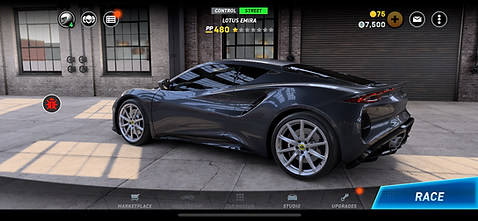
Old Garage
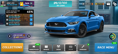
New Garage Proposal

New Garage Mockup
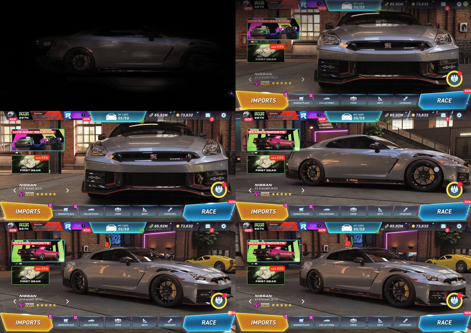
In game implementation of Garage Screen
1. Positive Impacts on the Game
-
Reduced Onboarding Friction: Immediate daily goals give clear direction from the second players launch the game, eliminating decision paralysis.
-
Enhanced Habit Loop: Prominent idle revenue and upfront goals drive frequent daily check-ins and session starts.
-
Higher Feature Visibility: Surface-level placement of the Race Pass, LTOs, and Live-Ops increased engagement with core monetization loops without feeling intrusive.
-
Smoother QoL Flow: Direct vehicle switching and simplified navigation eliminated menu clutter, keeping players in active gameplay longer.
2. Key Metric Uplifts (KPIs)
-
D1 & D7 Retention (+2%–3% Relative Lift): Driven by immediate daily objectives and instant idle rewards upon entry during soft-launch A/B testing.
-
Live-Ops & LTO Engagement (+3%–5% CTR Lift): Spurred by dynamic home banners raising direct top-of-funnel awareness for active events and limited-time offers.
-
Event Participation Uplift: Surfacing key events through a prominent garage banner system significantly increased top-of-funnel feature entry.
3. Player Feedback Highlights from External User tests
-
Clear Direction: "I know exactly what to do as soon as I open the game, no more digging through sub-menus."
-
Seamless Customization: "Switching cars right from the home screen makes managing my roster so much faster."
-
Instant Gratification: "Collecting offline earnings immediately on the main screen makes hopping on for quick sessions super satisfying."
Deep Dive 4: UX Process for Game mode UX
Problem Statement
Mid-game players hit progression walls when their primary garage lacks depth or specific upgrades, leading to drop-off during campaign downtime. Design the UX for Daily Drafts, a daily refreshing mode where players assemble a temporary team of 3–5 drafted cars to compete against an opposing team roster, allowing them to test diverse lineups, earn core rewards, and maintain daily session momentum.
Key UX Challenges
Game mode screen: Designing a high-energy entry hub for a new game mode that instantly communicates how to play, active milestone progress toward the final reward, and mode specific stats driving immediate engagement without overwhelming the player.
Opponent Selection: Upon forming a team, players select from three dynamic opponent tiers Easy, Medium, and Hard introducing a high-stakes risk-reward mechanic where harder opponents offer maximum point yields at the cost of maximum point loss upon defeat.
Pre-Race Matchup Clarity: Designing a high-speed selection screen that balanced a strict countdown timer against a hidden opponent whose strength was represented only by a total "Team Power" score. The UI had to prioritize track compatibility and car performance metrics at a glance so players could make fast, confident picks before time ran out.
Competitor Analysis
To craft an intuitive team-building loop, we benchmarked top-performing squad-battlers like Top Drives, WWE SuperCard, Marvel Strike Force, MCOC, and Top Troops. Analyzing these titles helped us adapt industry standard UX patterns for team power displays, stat-card readability, and hidden-opponent matchups enabling us to translate proven character-battler drafting mechanics into a fast-paced, racing-focused selection UI for CSR3's Daily Draft mode.

-
Strategic Team Roster Selection: All three games require players to curate and deploy a specific squad of vehicles or character cards before entering a match.
-
Pre-Race/Matchup Screen & Preparation: Each title incorporates a dedicated pre-battle transition screen to review matchup conditions, track details, or opposing decks before locking in selections.
-
Tactical Context Matching: Player choices are directly driven by external match variables, such as specific track routes, match types, or opponent alignment/power scores.
-
Sequential/Dynamic Selection Loop: Gameplay revolves around picking the right cards or units out of an available deck/pool to counter specific matchups in real-time.
-
Performance-Based Reward Scaling: Winning individual matchups scales overall performance, awarding progression metrics like stars, points, or bonus payouts based on total match dominance.
Logic Flow & User Journey Mapping
Collaborated closely with the Game Designer and Product Manager to map out a seamless logic flow for the entire player journey. We defined every touchpoint from launching the mode from the Garage, drafting a 3-car squad, and evaluating timed matchups, to racing opponents and claiming milestone rewards ensuring the UX aligned with core game mechanics and live-ops goals.

Key screens layout explorations
Based on competitive insights, layout explorations were conducted across the three primary feature screens: the Landing Screen, Opponent Selection Screen, and Versus Screen. The selected concepts (marked with green ticks) were chosen for their superior visual hierarchy, scannable information layout, and optimized thumb-zone ergonomics for fast two-handed mobile interaction. Furthermore, these designs minimized cognitive friction under time pressure, establishing a clear path from feature entry to race execution while surfacing critical data like track compatibility, active milestone progression, and team power at a glance.
Layout Exploration for Key Screens

End to end screenflow/Figma Prototype
Building on the logic flow, we mapped out the complete screen flow to cover all winning and losing conditions across every state. This included defining detailed screen layouts, stat update triggers, transition animations, and targeted visual effects. To validate the user experience before development, the entire flow was turned into an interactive prototype to test high-speed interactions, evaluate visual feedback, and ensure a seamless end-to-end player journey and mode comprehension. Here's a link to the detailed feature exploration in figma. Below is a gif of the prototype covering the win scenario. The losing scenario is covered in the figma file. And this is a link to the interactable prototype
External User Testing
To validate the experience, figma prototype was tested with 10 external participants, a mix of active and lapsed CSR2 players recruited via a user testing studio in Brighton. Working closely with the User Research team, we established targeted testing objectives to evaluate key interactions, layout clarity, and overall feature comprehension. Insights from the research report were triaged and prioritized (P0 through P3), allowing us to immediately resolve critical P0 and P1 usability friction points prior to production handoff. Following were some of the observations:
1. Player insight: Players wanted track hints before racing, as location names alone weren't enough to prepare for different track conditions.
Design Resolution: Kept tracks hidden on purpose. Leaving conditions unknown encourages players to build and maintain a diverse car roster across multiple classes, supporting the mode's core collection goals.
2. Player Insight: Earning an uncommon or rare mod after 3–4 rounds felt unrewarding compared to the time and effort spent playing.
Design Resolution: Maintained the planned mod payout for launch since this mode was a key source for them. To address the feedback, we later experimented with increasing the quantity of mods rewarded, allowing players to use duplicates to levelup theri mods, which improved player satisfaction.
3. Player Insight: Players found the car chemistry multipliers confusing and mistakenly believed they had to meet all requirements just to enter a race, even though the system permitted them to proceed.
Design Resolution: Simplified the mechanics by replacing complex multipliers with flat points awarded based on the number of team requirements met. This instantly made scoring clear while removing artificial friction at feature entry.
Beyond usability testing, we incorporated key feedback from internal stakeholder reviews to refine the feature before final implementation. To reduce unnecessary friction and trim overall session length, we merged the post-3-race sequence which was originally split across multiple screens in the prototype into a single consolidated results screen. This allowed players to see all race outcomes and watch their points tally update simultaneously. Additionally, we made screen transitions and UI animations significantly snappier while polishing the overall visual presentation to ensure a tight, responsive experience in-game.
In game implementation
The feature is currently live in CSR3. To meet aggressive live-ops shipping deadlines, production prioritized core functional UX and interaction clarity over decorative polish. Visual polish, advanced screen transitions, and upgraded UI art were intentionally phased for upcoming live-service iterations.
Conclusion & Design Leadership Impact
Leading the UX vision for CSR Racing 3 was a masterclass in balancing high-fidelity visual design with complex, live-service player journeys. Over three and a half years, this role shaped me into a strategic design leader capable of aligning game directors, product managers, and engineering leads around a unified experience framework. Beyond crafting systems, I established a collaborative, player-first culture within the studio:
-
Strategic Stakeholder Alignment: Partnered directly with Creative, Game Design, and Art Directors to translate high-level franchise ambitions into actionable UX architecture, aligning player experience with core commercial and retention goals.
-
Cultivating a UX-Thinking Culture: Transformed the broader team into a UX-centric studio by conducting regular workshops, knowledge-sharing presentations, and upskilling sessions to educate cross-functional partners on UX best practices, user psychology, and design thinking.
-
Team Building & Mentorship: Scaled and managed the UX department, directly leading two UX designers and mentoring junior artists to elevate design quality, establish Figma design systems, and optimize handoff workflows.
-
Scalable Systems Leadership: Engineered state-aware, modular navigation systems that eliminated UI technical debt and empowered live-ops teams to rapidly iterate on feature entry points using real-time telemetry.
Ultimately, this project reinforced my belief that world-class mobile UX extends far beyond polished interfaces. It requires inclusive leadership, scalable architecture, and the cross-functional trust needed to build sustainable, high-performing live-service titles.